

 Ads & Digital Marketing
 Website Design
 eCommerce Websites
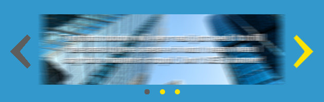
The short and sweet answer is no.
Of course, almost everyone who is thinking about getting a new web design wants a sliding banner, the thinking is that they add a cool factor and some animated magic to an otherwise static world. Also, many times people have several important messages that they want to show to visitors right away, and adding a sliding banner seems to be the right answer. But again, it is not.
This is a case where what seems like a great idea and makes perfect common sense, it is in fact wrong and for all intents and purposes, bad web design. Science can be inconclusive, but in the case of sliding banners, every single study (and our own case experience) shows that sliding banners are a really bad idea, affecting usability, SEO and most important, conversions.
Web design data on sliding banners
The following are two important case studies on sliding banners and banner blindness. Most usability and conversion experts in the world, recommend to never use a moving banner, especially if it is in your home page. So, here below I show you some actual data on studies about sliding banners. Judge for yourself.
The Notre Dame web design case
The first case is an analysis of user behaviour for ND.edu (a Notre Dame website) done by Erik Runyon technical director and a web developer for the University of Notre Dame.
Back in 2013, he reviewed the behaviour of a little over 3.5 million visitors to the nd.edu website over a period of 6 months. What he found was that of all the users who visited the website, only 1% clicked on the banner. Of those, 89.1% clicked on the first banner. This means that of that 1% who paid attention to anything on the sliding banner, the majority did not even see the rest of the banners. All those great offers or that amazing information on banner number 2, 3 and 4, most people never see it.
The NN/g study
Nielsen Norman Group is an important user experience research, training, and consulting firm. Some of the world’s brightest conversion and design minds are part of that firm. They have researched the subject of banner blindness on several occasions and published their findings in books, blog articles and conferences.
In a study done for Siemens Appliances, users were asked to complete the following task: “Does Siemens have deals on washing machines?”
Users had to find the website and read the first sliding banner on the homepage. The banner and the washing machine’s offer were the biggest elements on the page, so the expectation was that users had to see it, no matter what. Yet, most failed to even discover whether Siemens was in fact having deals on washing machines. When asked about it, the common answer was that the sliding banner moved too fast and they couldn’t read it.
On another case, they used eye tracking software to study people’s fixation (attention to an element on a web page) on banners. They found that most people simply ignore anything that moves on a website.
NN/g recommends that sliding banners and carousels should show a new banner only when the person asks for it. Otherwise, it should stand still and let people read the information at their own pace, without being rushed.
SEL’s observations
SearchEngineLand is one of the industry’s top blogging websites. Harrison Jones, a usability expert wrote an article about carousels and sliding banners. He studied three different B2B websites, a branding website, a thought leadership site and a service promotion site.
…barely anyone clicks on the carousel.
The first website showed that only 0.65% of visitors clicked on the banner, of the second case, only 0.22% and the third website had only 0.16% users clicked on the sliding banner. This was measured by having event tracking on the sliding banners and other elements of each website (a feature of most analytics tools) and proves that most people simply ignore sliding banners. Harrison Jones concluded that “Nobody clicks on the carousels“. Well, to be exact, less than 1%.
SearchEngineOp’s own experience
For years now, we have recommended our clients to not use moving or sliding banners on their websites. In some cases, the client insists on having a moving feature and we give in. However, every single time we’ve managed to convince a client to remove the sliding banners, conversion increases drastically and in some cases, even ranking in Google. More important, our highest performing websites, including our own, have a static home banner.
When we review click-through on moving features, we find that on average 1-3% of visitors click on something that moves. In some cases, that number is as low as 0.12% click on sliding banners compared to a 80% average clicks on static banners with a call to action. On mobile, numbers are worse than for desktop for sliding banners as users have a harder time reading sliding banners.
..as low as 0.12% click on sliding banners compared to a 80% average clicks on static banners with a call to action.
Well thought out design can solve the problem of having multiple offers or messages that you need to feature right away. There are many alternatives to having a sliding banner or carousel that have better performance that there is no reason to ever use one.
SEO and Conversion Optimization
While the data shows that people click very little on sliders and other studies have shown that people don’t even see them, there is yet another problem with sliders. Sliders push down your content. This means the content won’t even be visible above the fold. And this just bad SEO. It is not the large image that is the problem, the problem is the automatic movement of the slider.
There’s not a Conversion Optimization expert that will disagree on this: sliders kill conversions. So, as you may imagine, at SearchEngineOp we don’t recommend them.
Is there any time when a slider would work?
Oddly enough, yes there is. But there are very specific conditions and it definitively can’t be set to autoplay. For a carousel to not affect conversion (and sales), it must be static and should only move when the user clicks on an arrow or any other element on it that indicates movement will happen.
If you want your website to perform better and have higher conversion rates, give us a call, our website design is conversion optimized and we can help you setup conversion optimization tests. Sometimes you have the traffic and is conversion rate where you are loosing business.
Setup a Meeting to Discuss your Website Conversion